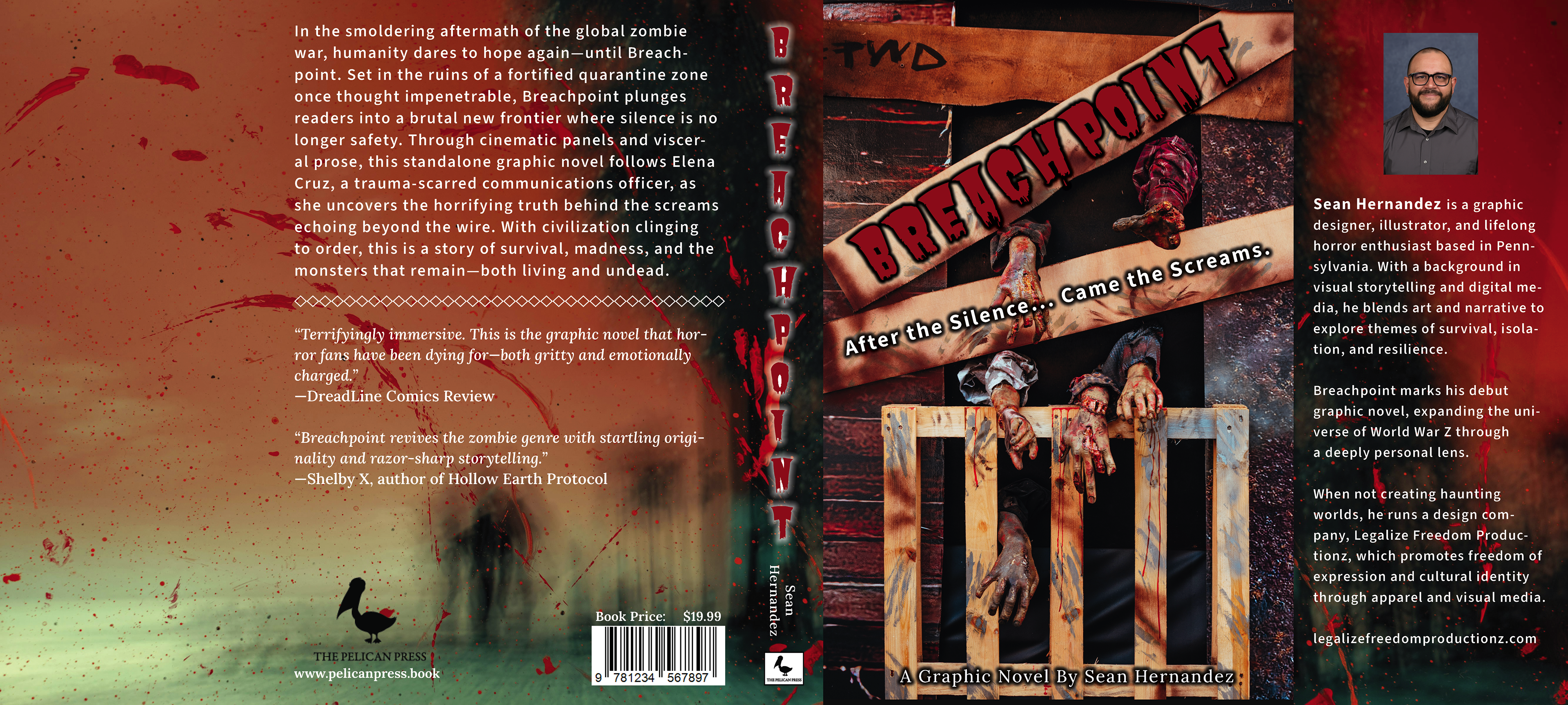
Breachpoint – Book Jacket Design (Horror Genre)
The Assignment:
For my Typography course at SNHU (GRA-340), I was tasked with creating a full book jacket design. The challenge was to select a genre, define a target audience, and then design all parts of the jacket—front cover, back cover, spine, and flaps—while applying typography principles and design best practices. I chose the horror genre, aiming to capture the atmosphere of fear, tension, and survival that defines the audience’s expectations.
The Design Challenge:
Front cover: Title, subtitle, author name, an image/illustration, and genre-appropriate typography.
Back cover: Book summary, testimonials, publisher’s information, price, and barcode.
Spine: Title, author, and publisher logo.
Flaps: Author bio, photo, and supporting design elements.
Typography had to remain legible, genre-aligned, and consistent, while also building hierarchy and contrast across different sections of the jacket.
My Process:
Step 1 – Concept & Research
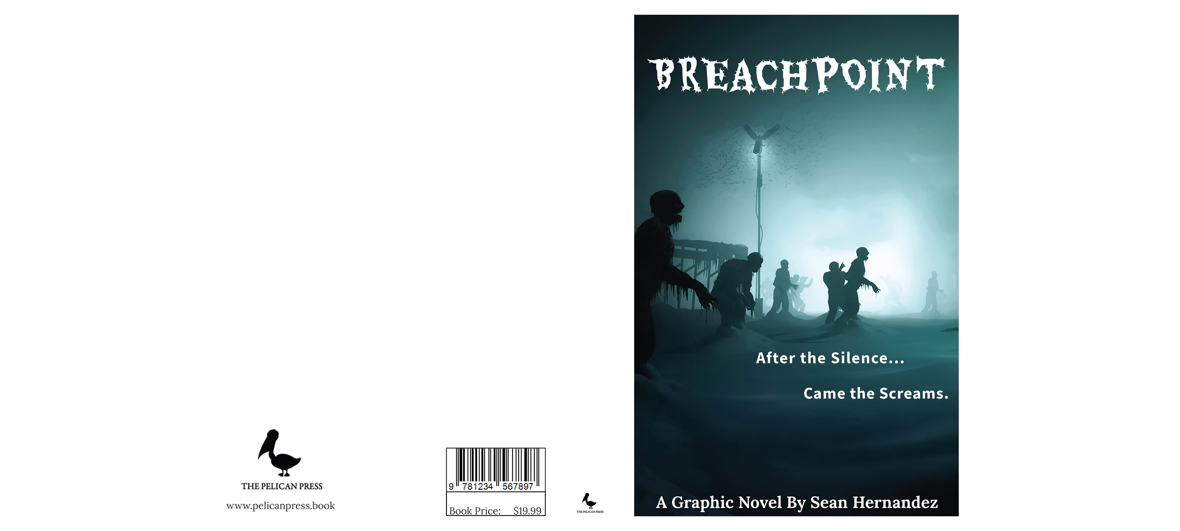
I began by exploring horror book covers and graphic novel aesthetics, focusing on typography styles that communicate fear and intensity. Sharp serifs, distressed sans serifs, and bold contrasts quickly stood out as strong candidates. I sketched initial layouts and considered imagery that would complement a post-apocalyptic horror theme.
Step 2 – Mockups
I developed two mockups in Adobe InDesign to test typography options and layouts:
Mockup 1 - A darker, high-contrast design with bold type and distressed textures to heighten the sense of dread.
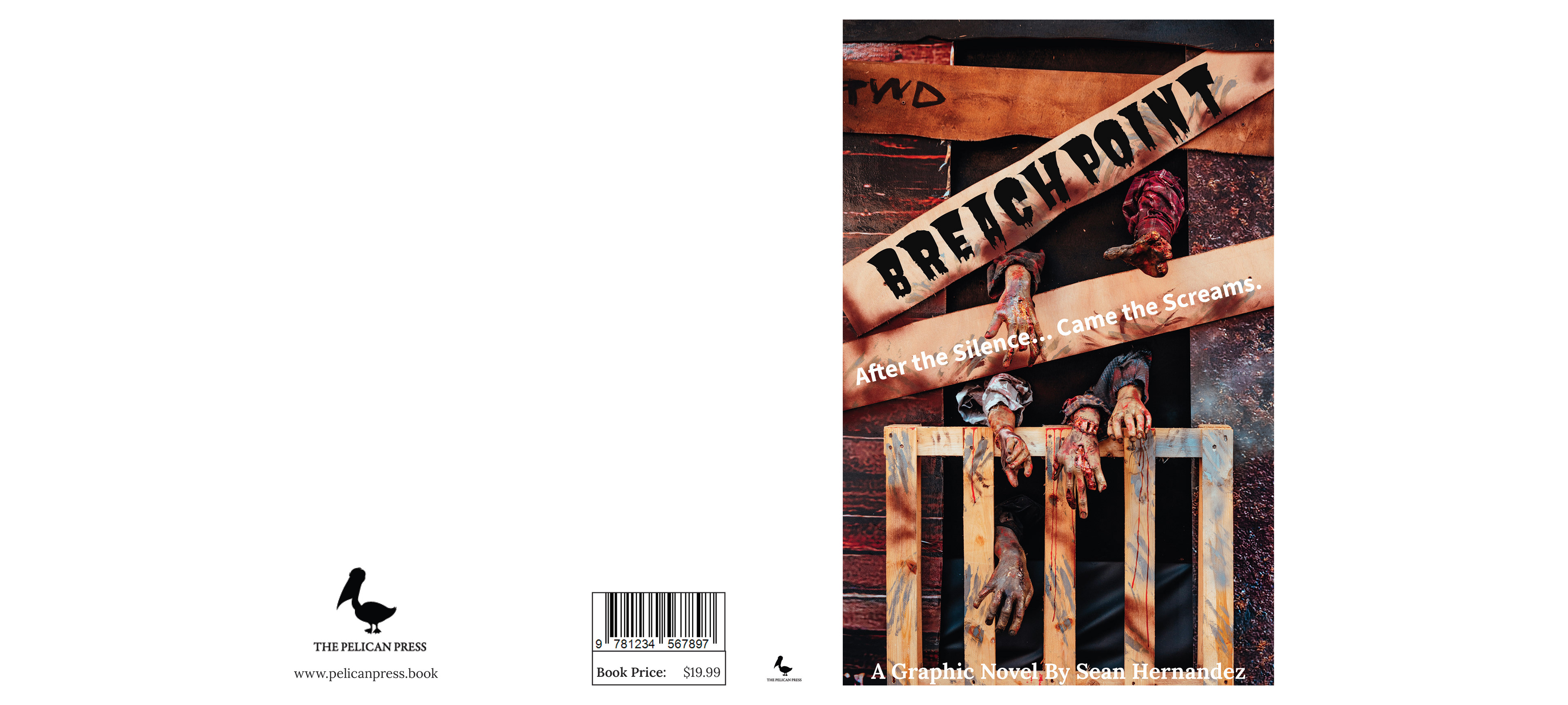
Mockup 2 - A variation with different type hierarchy and refined spacing, allowing me to test how proportion and balance changed the overall tone.
These mockups served as experiments in applying kerning, tracking, leading, and hierarchy principles. They also helped me decide which type combinations communicated the horror theme most effectively.
Step 3 – Feedback & Iteration
After presenting my mockups, my professor praised the typography direction and suggested a few refinements to spacing and balance. I incorporated these adjustments in my final submission, sharpening the readability without losing the atmospheric tension.
Step 4 – Final Deliverable
The completed design, Breachpoint, integrates all required components:
Typography: A mix of 2–3 typefaces to balance grit with legibility. Titles use a bold, horror-appropriate display font, while body copy employs a clean serif for readability.
Color Palette: Primarily dark tones with contrasting highlights (red accents against muted greys/black) to build hierarchy and convey unease.
Front Cover: Title, subtitle, author’s name, and imagery arranged with strong hierarchy and contrast.
Back Cover: A short book summary, two testimonials, publisher branding, and barcode laid out with clean alignment and effective text wrapping.
Spine: Title, author, and publisher’s logo balanced for legibility and impact.
Flaps: A concise author biography and photo on the front flap, with subtle supporting design elements on the back flap.
Result:
I earned an A (185/200) with high remarks, and my professor specifically noted the strong integration of typography with genre conventions. He recommended only minor adjustments, which I implemented to finalize the design.
Takeaway for Clients:
This project demonstrates how I approach design challenges from concept to completion—researching audience expectations, testing ideas through mockups, applying feedback, and refining until the design communicates clearly and powerfully. It also highlights my ability to use typography as a storytelling tool, not just a visual element, to bring a narrative to life.
Mockup 1
Mockup 2