For this project, I was tasked with designing a magazine page for The Cultural Chronicles, an educational publication focused on celebrating global heritage and diversity. The brief was to create a layout that highlighted Native American Heritage Month, with a clear goal of engaging a younger audience between the ages of 12 and 18. The client emphasized a modern, approachable design style—bold colors, simple visuals, and easy-to-read typefaces (steering away from cursive, which the target readers might struggle with).
I started with the client’s content package, which included the article title Preserving the Legacy: Native American Heritage Month, a subhead, byline, pull quote, and placeholder body text. Right away, I thought about hierarchy: how to guide a reader’s eye through the headline, subhead, pull quote, and body copy in a way that felt natural but still visually striking. Using a grid system as my foundation, I balanced typography with negative space, ensuring the text blocks had strong readability while leaving breathing room for the imagery.
Typography was key. I paired a clean, modern sans serif with a more traditional serif to create contrast while keeping the tone respectful and accessible. The pull quote—“In heritage, we find strength, wisdom, and enduring unity”—became a focal point, set larger than the body text but smaller than the headline, giving the page rhythm and depth.
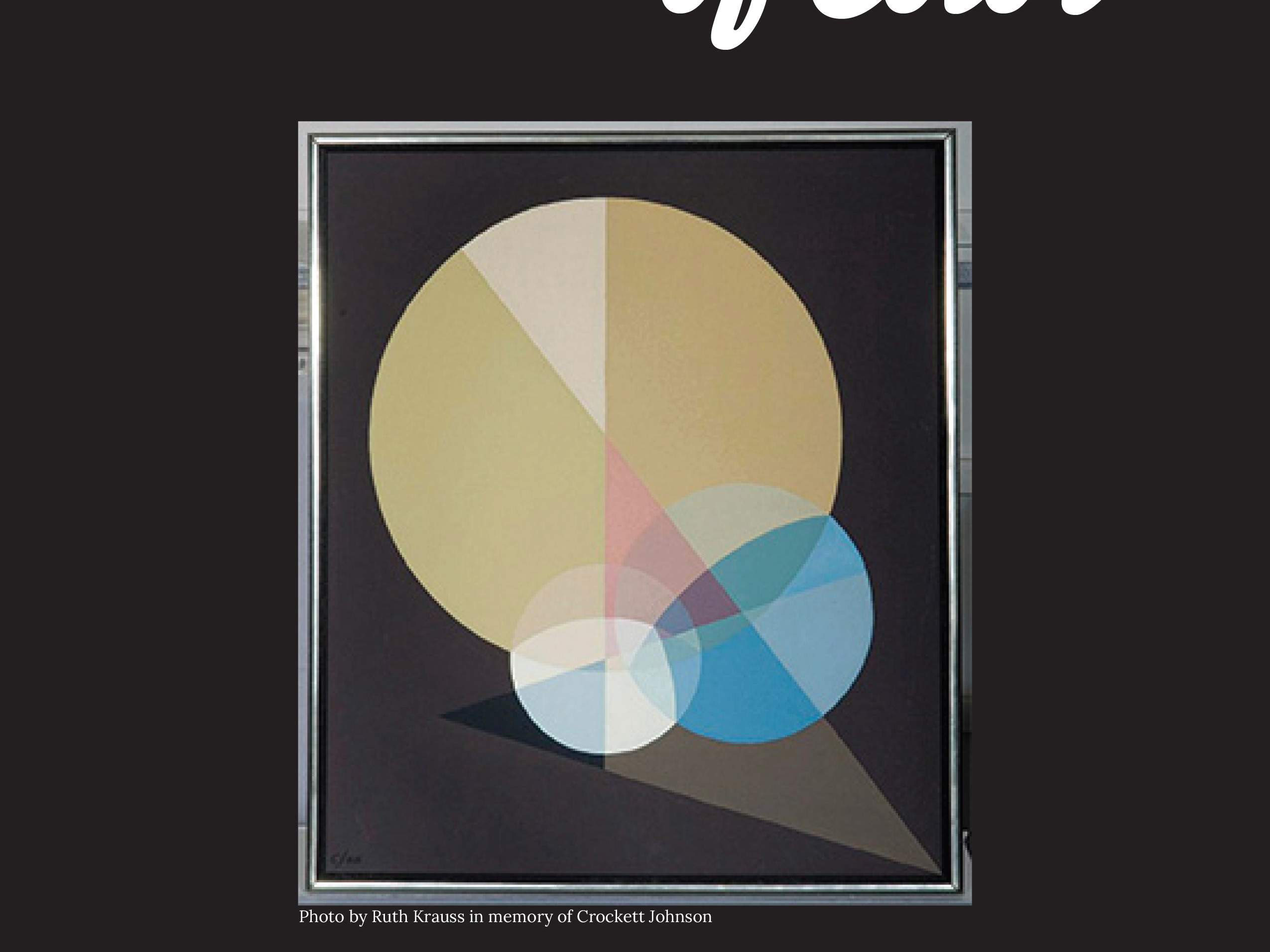
Color choices were driven by the brief: bold but not overwhelming. I leaned into earthy tones inspired by Indigenous culture, supported by bright accents to capture the younger audience’s attention. The photograph, sourced from Unsplash, became an anchor element, with the caption “A great heritage” tying directly back to the article’s theme.
The final layout reflects a balance of visual storytelling and typographic clarity. Every element—grid alignment, font pairing, pull-quote placement, and color palette—works together to honor the cultural significance of the piece while making it engaging for a teenage readership. The result is a design that feels modern, vibrant, and respectful, successfully bridging tradition with contemporary editorial design.

