
For this project, I was tasked with designing a tri-fold brochure for Piddle Paddle Tours, a company specializing in private tours, group tours, and boat rentals. The brief required an engaging layout that highlighted the company’s services, showcased their destinations, and delivered a clear call to action. Since this brochure would serve as both a promotional and informational piece, it needed to balance eye-catching visuals with structured content.
I began by setting up the document in Adobe InDesign using the specified dimensions: 11” x 17” flat with a tri-fold layout. From there, I built a grid system to ensure alignment and flow across all six panels. This gave me a framework to manage text blocks, imagery, and negative space so nothing felt cluttered.
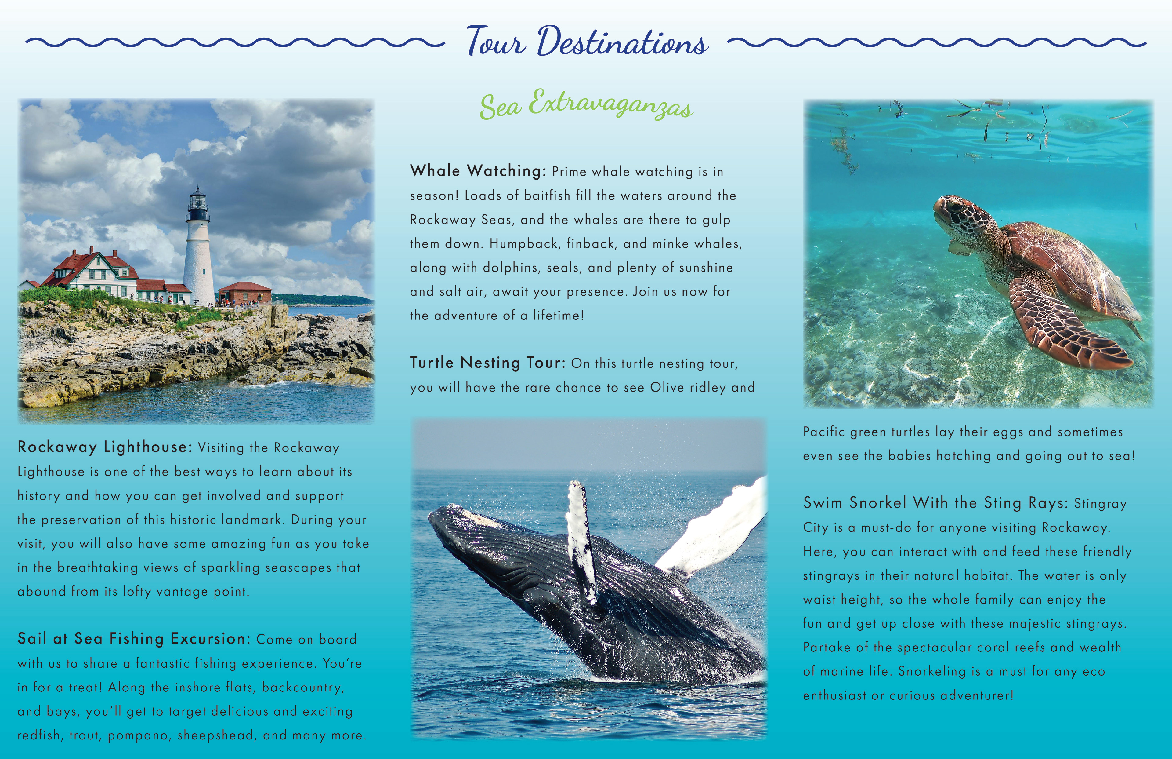
On the cover panel, I prioritized the logo and tagline, pairing them with a strong, inviting image that immediately set the tone for adventure. Inside, I organized the brochure around typographic hierarchy—bold headers for services and destinations, clean body text for descriptions, and playful accents like the wavy line under “Tour Destinations” to add visual rhythm. I leaned into sans serif fonts for readability while adding subtle variations in weight to create contrast.
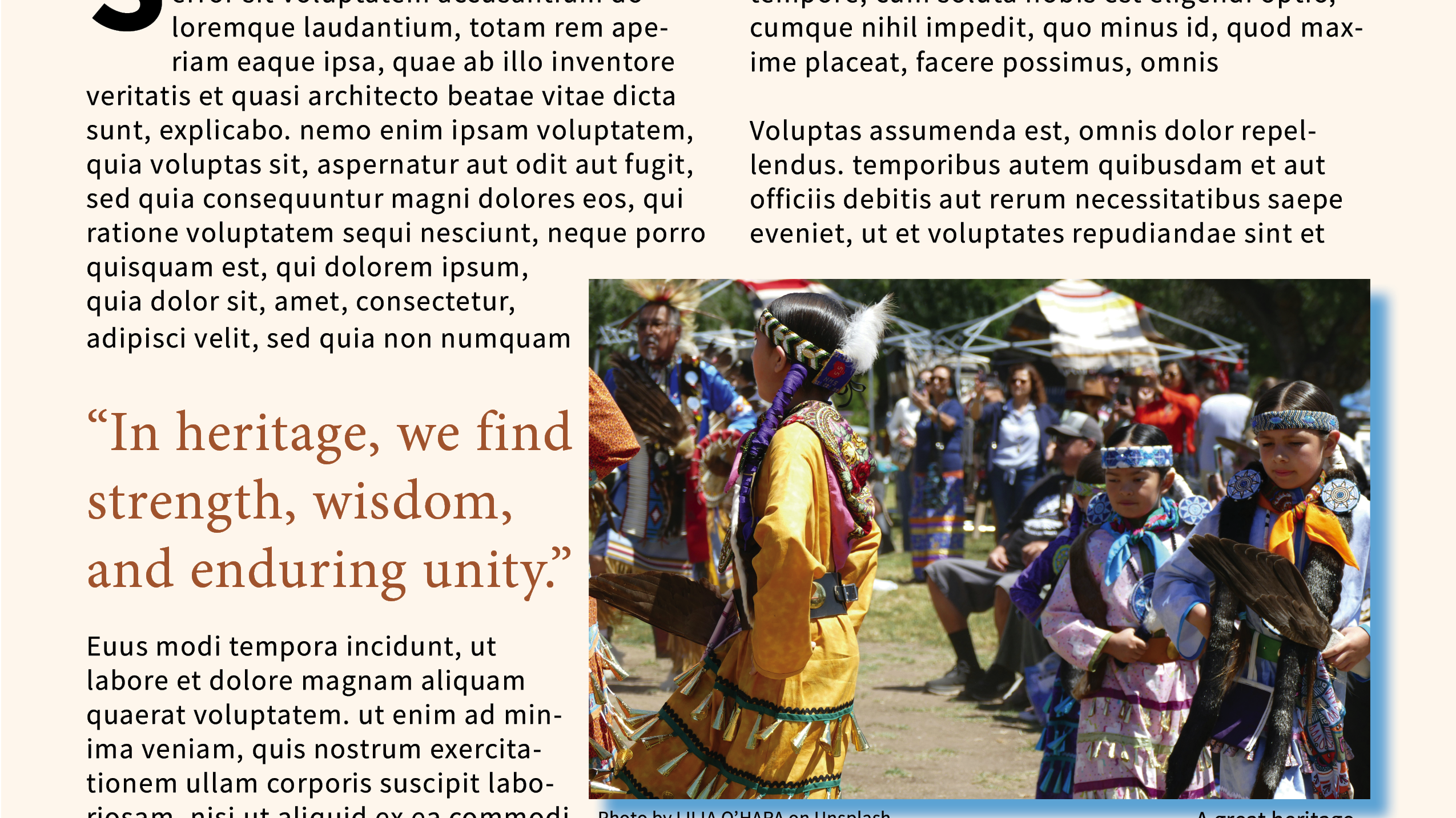
Imagery played a huge role in storytelling. I used high-resolution photos of whale watching, turtle nesting, snorkeling, and the Rockaway Lighthouse to immerse readers in the experiences. By strategically placing images alongside descriptive copy, I let the visuals and words work together to evoke a sense of exploration and excitement.
Color was another key element. I applied bright, beach-inspired hues—greens, teals, and blues—that tie directly to the aquatic theme. These colors were balanced with clean white space to avoid overwhelming the layout, while still delivering a vibrant, summery feel.
The final deliverable is a professional, engaging tri-fold brochure that captures the adventurous spirit of Piddle Paddle Tours. Every design choice—from the grid and typography to the color palette and imagery—was made to guide the reader smoothly from services to destinations to the call-to-action on the back panel. The result is a brochure that not only informs but also inspires customers to book their trip of a lifetime.